Modified Design Sprint
An iOS app that improves the experience in museums or galleries to view art.

Museums & Galleries are trying to increase customer satisfaction while viewing art- mainly museums that showcase paintings, sculptures, installations and similar types of media. GalleryPal wants to design a way to improve the experience of viewing art in a museum or gallery.
What is GalleryPal?
My Role
Product Designer: Responsible for the entire design process including research, product Design, visual design, prototyping, and usability testing.
How might we design a way that improves the experiences of the people viewing art while in a museum or a gallery?
Design Question
Main focus is to improve the in-person viewing experience
The solution needed to be a mobile app or a mobile-optimized website.
Constraints
Project Timeline
Day 01- Understand
Secondary Research- Highlights
I began day 01 by conducting primary research. As part of I asked the interviwees the following question-
“Tell us about a recent time you visited an art museum or a gallery.”
Based on our conversations, I gained some insights:
Through talking to folks going to the museum, I gained some insights:
People like knowing a bit about art when they’re at the museum, otherwise they feel like they’re missing out on the full experience.
It helps to form an opinion about the artwork by getting some background information about the artist or their intentions behind the artwork & learning more about their technique.
Even after background research, sometimes the arts that catch the eye are the ones that were not read about beforehand.

“Sometimes I’ll do a quick Google search for a painting while on my phone while at the museum.. but I usually just find long articles that are super overwhelming.”
-Nick


“I don’t really enjoy group tours because I like to do my own thing…but sometimes I listen in to learn a few facts about the artist, or the piece itself.”
-Ryan
“There are so many times I find myself saying ‘how did the artist do that'?!’- I would love to know more about their process and technique.”
-Dana
I got some interesting responses-
User Persona
The research highlights was useful in creating the following persona-
Finding “How Might We…” questions
The “How Might We” questions help turn challenges into design opportunities. These are the HMW questions I came up with:
How might we educate the user on the art and the artist without making the process of learning tedious or boring?
How might we make the user’s museum visits more worthwhile/ enjoyable?
How might we make the user feel like they know enough about the art to be able to appreciate it?
Creating a Journey Map
As a part of the sprint, I wanted to jot down a quick solution for an end-to-end user experience & therefore, I drew a journey map writing down the user’s journey through the app from a birds-eye view.
Day 02- Sketching
Lightning Demo
On the second day of the design sprint, I started with a quick competitive analysis. For the lightning demo, I decided to look at apps like Netflix, Baby Center, Walt Disney Family Museum. I chose each of these applications for one of their existing design features.
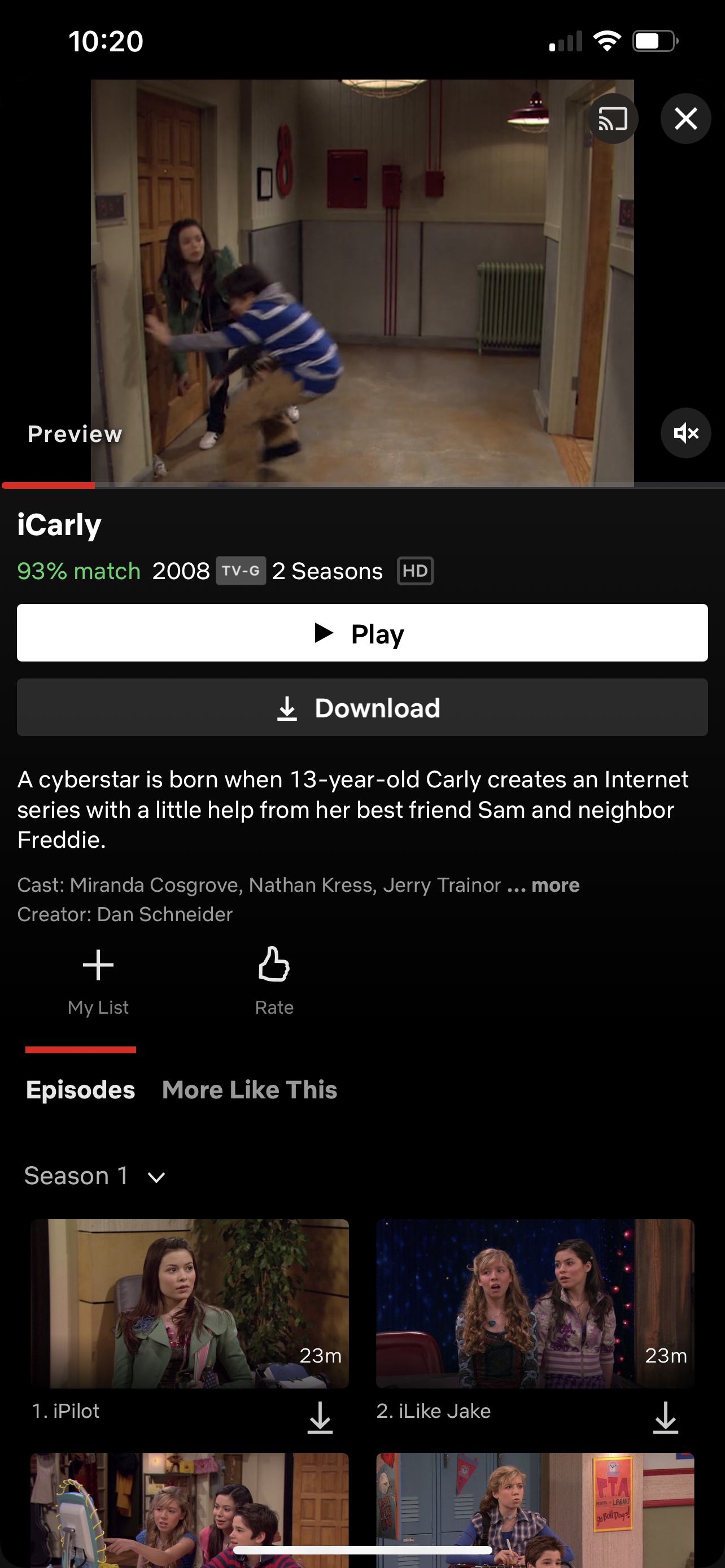
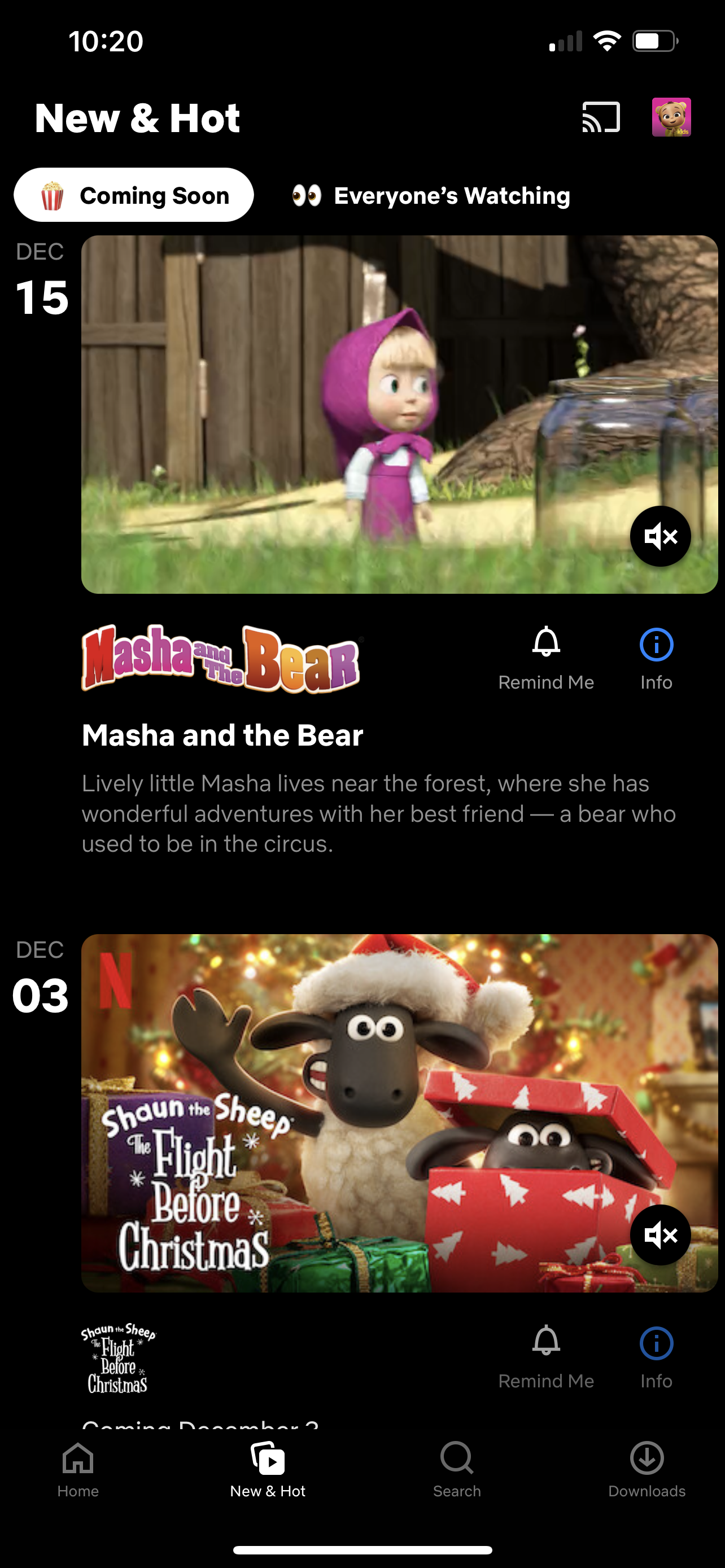
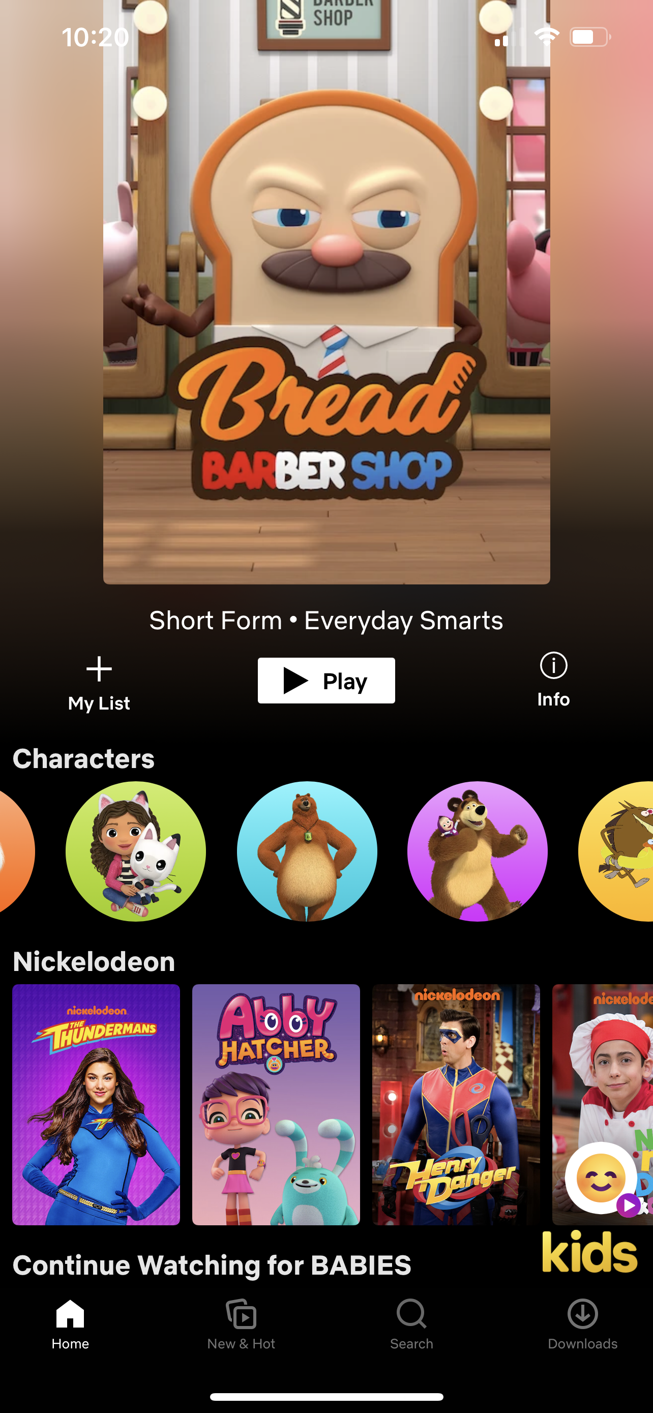
1. Netflix- I chose to look into the mobile version of Netflix’s interface to find out what works the best.
Carousel on home screen which keeps updating with the arrival of newer content. This means that the viewer has the option of watching the latest items at will.
Every thumbnail leads to a preview screen of said show which also has a small description at the bottom.
Home screen has a new & hot button which features new and upcoming shows.
2. Babycenter- Next I looked into Babycenter, a pregnancy centered app geared towards expecting & new mothers.
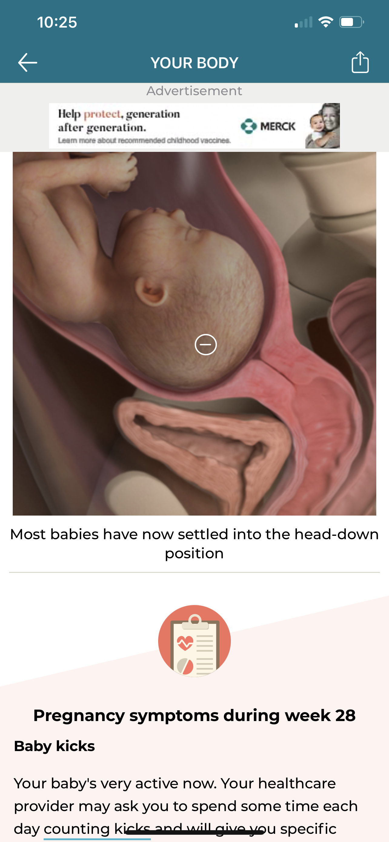
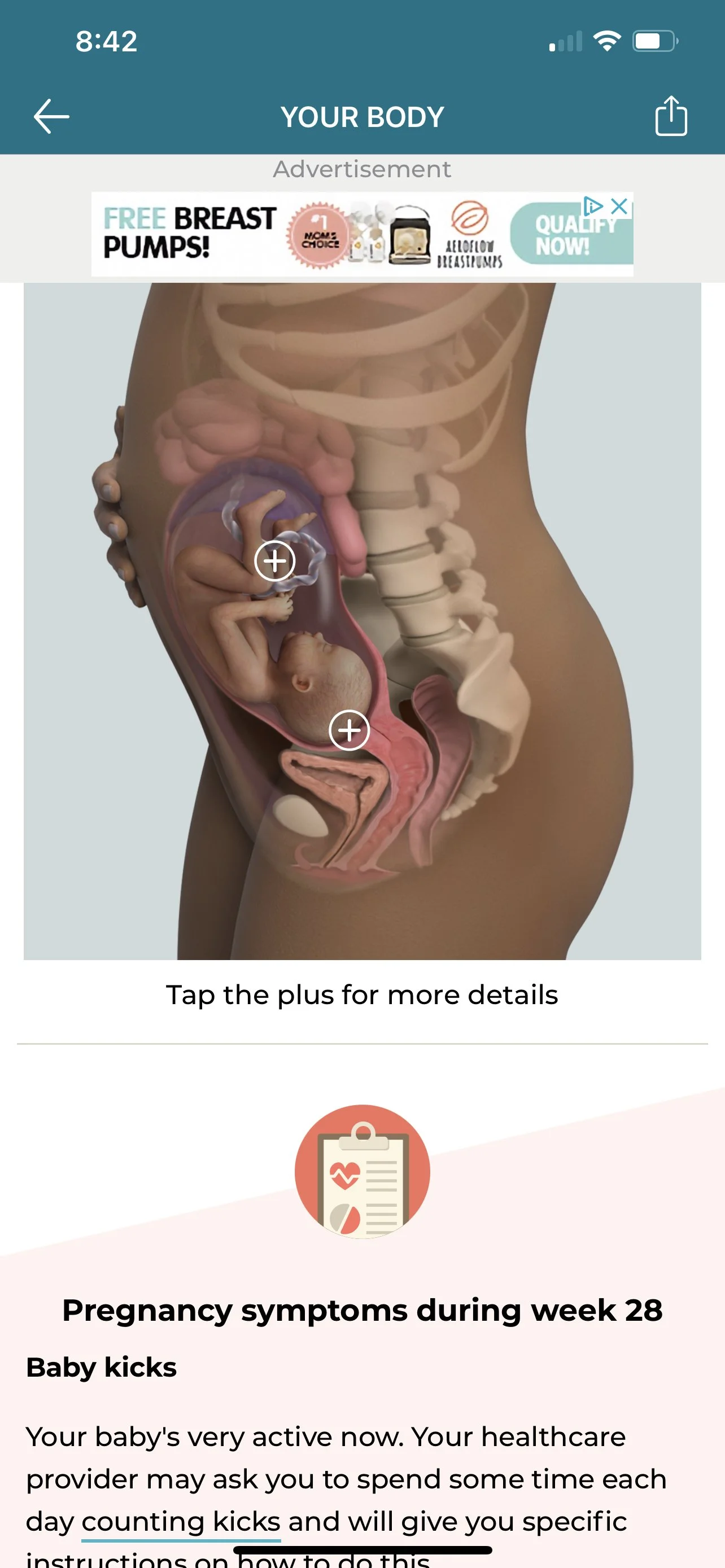

One of the unique features in this app is that on a detailed image, there is an option to learn more about important highlights by tapping the “+” icon located on the image. By clicking the icon, a small description appears listing all the crucial changes happening to the baby during that particular week.
3. Walt Disney Family Museum- The Walt Disney Family Museum is an app dedicated to the Walt Disney Museum in San Francisco, CA. This is an app that’s basically designed to make the visitors in-person experience smoother.
The main gallery tour can be downloaded in a podcast format where a narrator tells the visitor where to go & what particular attraction he/she will encounter following the guide's voice. The narration can be paused, played, forwarded just like a regular recording but it provides direction to a tourist who is visiting the museum solo & unguided.
Crazy 8’s Sketches of the Critical Screens
Initial sketches- I decided that the individual art would be the critical screen. Since the primary goal of the GalleryPal app is to improve the experience of viewing art in a museum or gallery, it seemed logical to take a stab at that particular window. I sketched out some possible solutions using the crazy 8’s method and decided to move on with the second sketch from the left on the bottom row.
Drawing solution sketches- After deciding on the critical screen, I moved on to designing the solution sketches for the critical screen. I drew the three panel sketches showing the screen that comes before the critical screen, the critical screen itself, and the screen that comes after the critical screen.

initial sketches
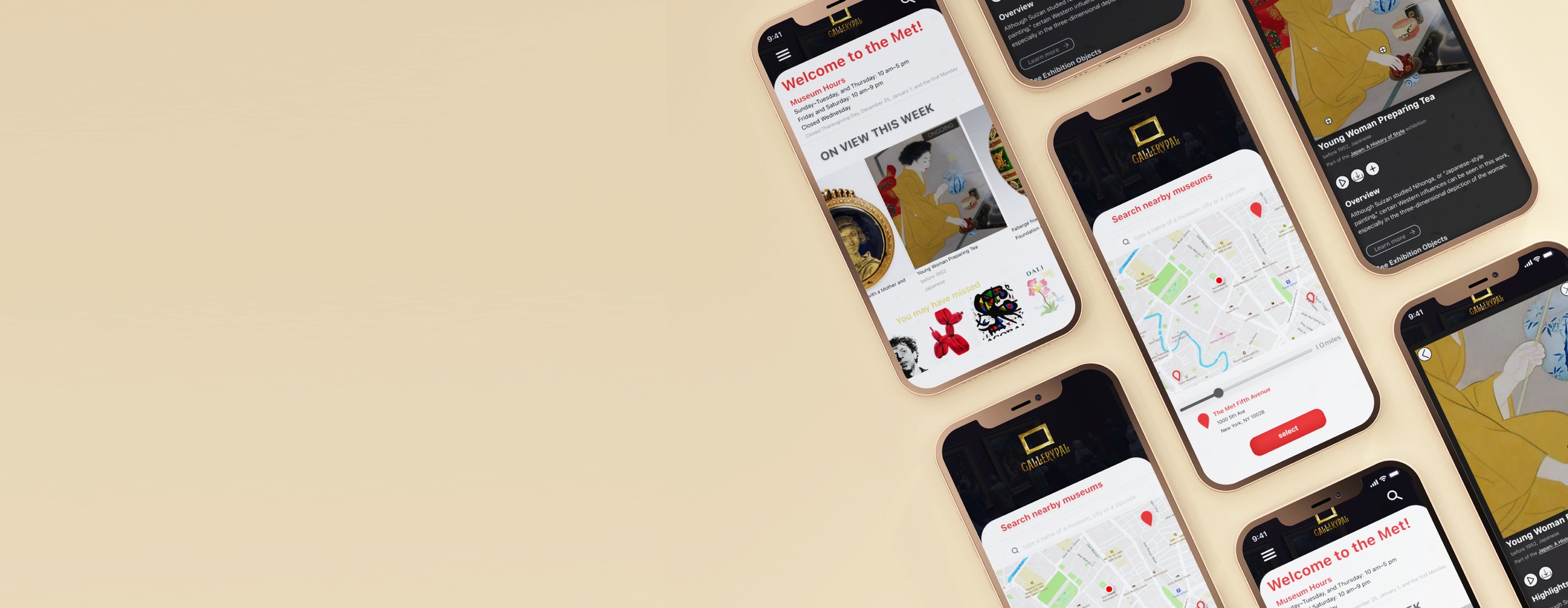
solution sketches
In the solution sketches, Page 01 on the left is the landing page. On that page, upon tapping on one of the items under “on view this week” menu, the user will arrive at the Page 02 (our critical screen) where details are listed about the artwork. Tapping the play button on that page will lead the user to Page 03 (rightmost screen) where the same highlights are narrated one by one. The artist’s overview is also located here for those interested.

Day 03- Decide
Day 3 consisted of illustrating a storyboard to support the solution that was developed.
Storyboard Illustration

The flow starts at the login page which leads to the map page.
The user can tap on one of the museums on the maps page to go to their homepage .
The homepage has important information about the museum with all the current exhibitions & pieces on display.
Tapping an art leads the user to the page where there is information about that particular art. On this page, the user can tap on specific areas of the picture to read about highlights of the art as well as listen to the narrated version of the same highlights. The user can also download these excerpts for free & then listen to them later.
The last page shown on the storyboard has more items/ pieces/ artwork from the artist in case the user finds the artist's work interesting or worth exploring more.
Day 04- Prototyping
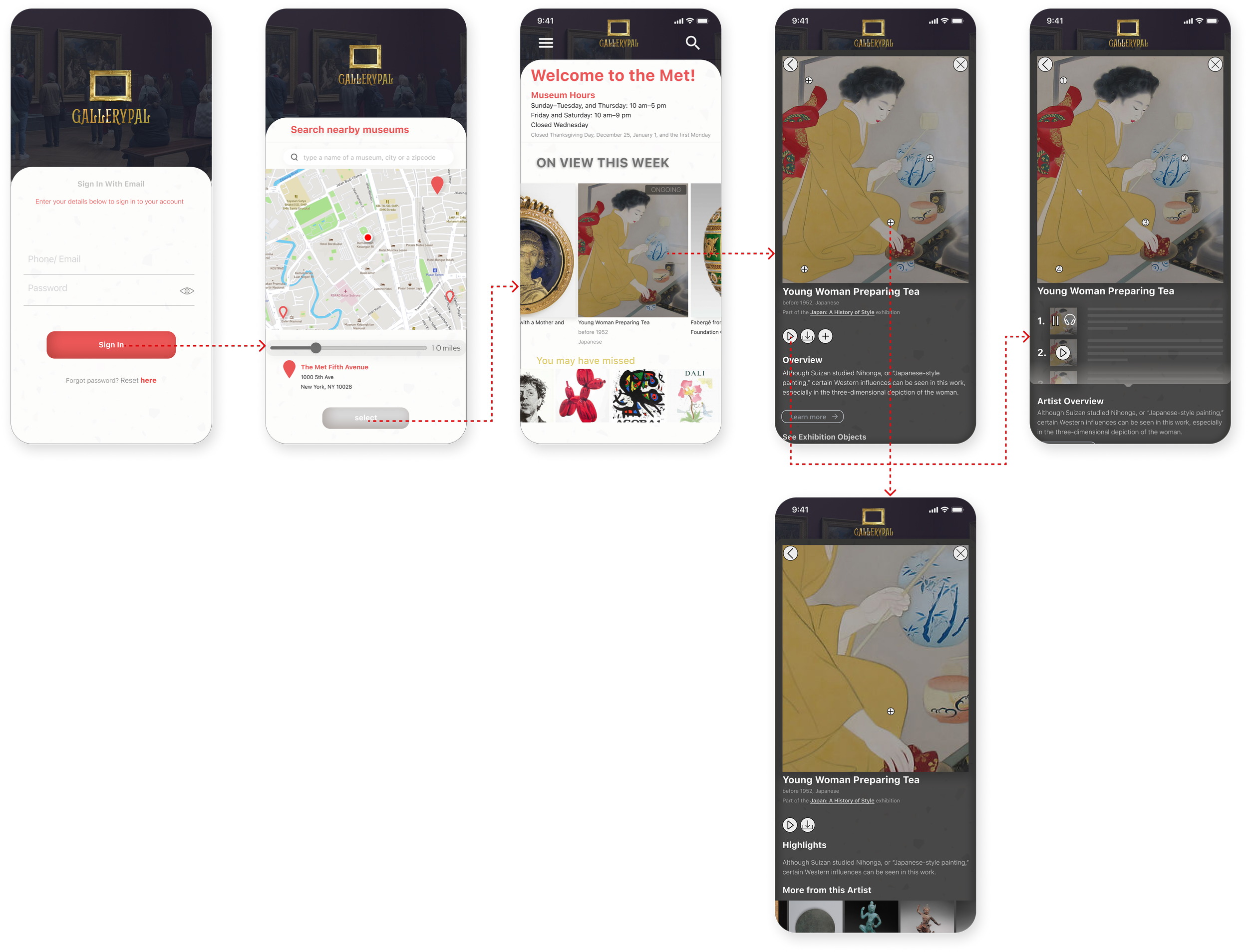
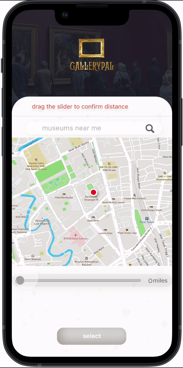
The fourth day consisted of prototyping. Using the storyboard that was sketched out the previous day, I used Figma to build my wireframes. During the process, I adjusted the sketches to design a couple interactions in detail. For instance, sketch screen no.2 was made a bit more in-depth so the user could type the name of the museum & then slide the distance slider to press the search button & then move on to the next page by tapping select.
Making a Prototype
View the prototype here.
Day 05- Test
I conducted usability tests with 5 participants.
4/5 users had similar comments- they all liked the tap & zoom feature which enabled the user to read some quick highlights about the artwork.
There were some comments about other aspects of the flow-
Usability Testing- Highlights
comment-
1/5 users commented that the home page could be made a bit more clutter free.

comment-
2/5 users said that the search by museum page was a bit confusing, the interaction could be a bit more straight-forward.
revision-
after clicking on a particular museum, the user can use the select button to go to the homepage of that particular museum.

revision-
the new UI looks more streamlined & cleaner.


Conclusion
This project was a bit challenging, but it pushed me to focus on the critical items on hand. The main focus of the design sprint was to solve problems with fast solutions without thinking too much about other details. Although the prototype wasn’t perfect, it was enough to get the user from point “A” to point “B” which was to learn about some important details about a particular art that is being showcased at a museum or a gallery. I am glad I was able to work in a time crunch as it helped me zero down on the most important tasks to be solved. Going further, I would try to iterate another version which may include some added interactive features.
You May Also Like