A One Stop Subscription Tracker for All
UX/ UI Case Study
Project Statement
It’s difficult to keep track of all the products and services that we subscribe to each month. All we see is money deducted from our accounts for services that we might not even need or want anymore. Dashboarddeck is a company that has a desktop-based product that keeps track of all of the subscription fees on websites, apps, services, etc. Currently, due to the desktop-only version, Dashboarddeck is missing out on a wider range of audiences; adding a mobile friendly version will significantly increase their market reach.
Solution
The company wants to develop a mobile-friendly version to better manage the users’ subscriptions & spendings. This version will include the following:
A mobile-friendly version to organize all the subscriptions and analyze spendings.
Subscription cancellation through the app for prevention of needless spending
Customer control over subscription auto-renewal
Target Users
Over 30 years of age
Equally split between men and women
Middle class trying to be more budget-conscious
Have experience using phone and desktop
Expand to German-based market
Role
UX/UI Designer- Responsible for end-to-end process including conducting research & designing the final product.
Tools Used
Miro, Sketch, Figma, InVision, Photopea etc.
Secondary Research
Discover/ Empathize
To begin, I started with secondary research to get a better idea about the importance of having useful subscription services that keep track of budgeting & help the user to reduce unnecessary spending. As part of the project, some of the information was already provided to us. Based on that & the criteria of the user group, I started with looking into apps that successfully keep track of people’ s monthly spending habits.
Firstly, I looked into various management apps to see how these products were keeping track of people's spending habits as well as helping them keep large projects organized.
Some of the dominants in the industry in those aspects are Smartsheet, Mint, Toggl Track, TimeTree etc.
Dashboarddeck’s journey- from Desktop to People’s Mobile Devices
Competitive Analysis:Takeaways
Discover/ Empathize
Empathy Mapping
The project was such that, the result of the user interviews was provided to us beforehand. Taking that into account along with the rest of the secondary interview, I proceeded to the empathy mapping. The empathy map was broken down into what the users think & feel, say, see & do. I also wanted to take a look at people’s pain points & also factors that motivated them.
Persona
Based on the information and insights gathered from the Empathy Mapping, I constructed a User Persona that represents the main user group of my product.
“How Might We…” Problem Statement
With this persona in mind, I wanted to design an app that would accommodate people’s subscription needs. I wrote out my problem statements and “How Might We…” questions:
How might we create the opportunity for the users to save time & money while using the app?
How might we reduce subscription fatigue while retaining most users?
How might we reduce needless spending of the user?
How might we make the app more intuitive, user friendly & easy to understand so the user feels comfortable?
How might we enable the user to distinguish between good to have apps & absolutely necessary ones so they can allocate budget accordingly?
How might we make the app accessible to a wide audience?
How might we engage people from a different market (i.e. german market)?
Ideate
Brainstorming
I used several brainstorming strategies to start on the path towards solutions. I used the “How Might We” questions to start brainstorming. Due to the time & project constraints, I decided to focus on some HMW questions.
-How might we create the opportunity for the users to save time & money while using the app? (for current & returning user)
all subscriptions in one place
Swipe (left/right) to freeze or delete subscriptions
Filter option to organize subscriptions according to usage
Limiting amount of money spent on certain subscriptions.
-How might we reduce subscription fatigue while retaining most users? (for current users)Subscription tracker to notify the user about inactive/ unused app subscriptions
Auto cancellation if inactive for over 45 days
-How might we reduce needless spending of the user? (for consumers)
Notifications 7, 3, 1 day(s) before the next payment cycle
Questionnaire about the likelihood of using an app while subscribing
-How might we enable the user to distinguish between good to have apps & absolutely necessary ones so they can allocate budget accordingly?
Habit tracker to notify the user about recent changes in usage
User Stories & MVP
Based on problem statements & ideation, I created user stories using the “Google Sheets” template. To fill up this form, I started with the high level functionality action (epic), then moved to the user stories using the phrase “as a { } user, I want to { }”. After considering the priority, risk & value, it made sense to make all user stories part of the Minimum Viable Product (MVP).
User Flow Diagrams
The user stories helped me narrow down specific functions that I wanted to explore further. As the next step, I created user flow diagrams for the critical paths in the user’s journey.
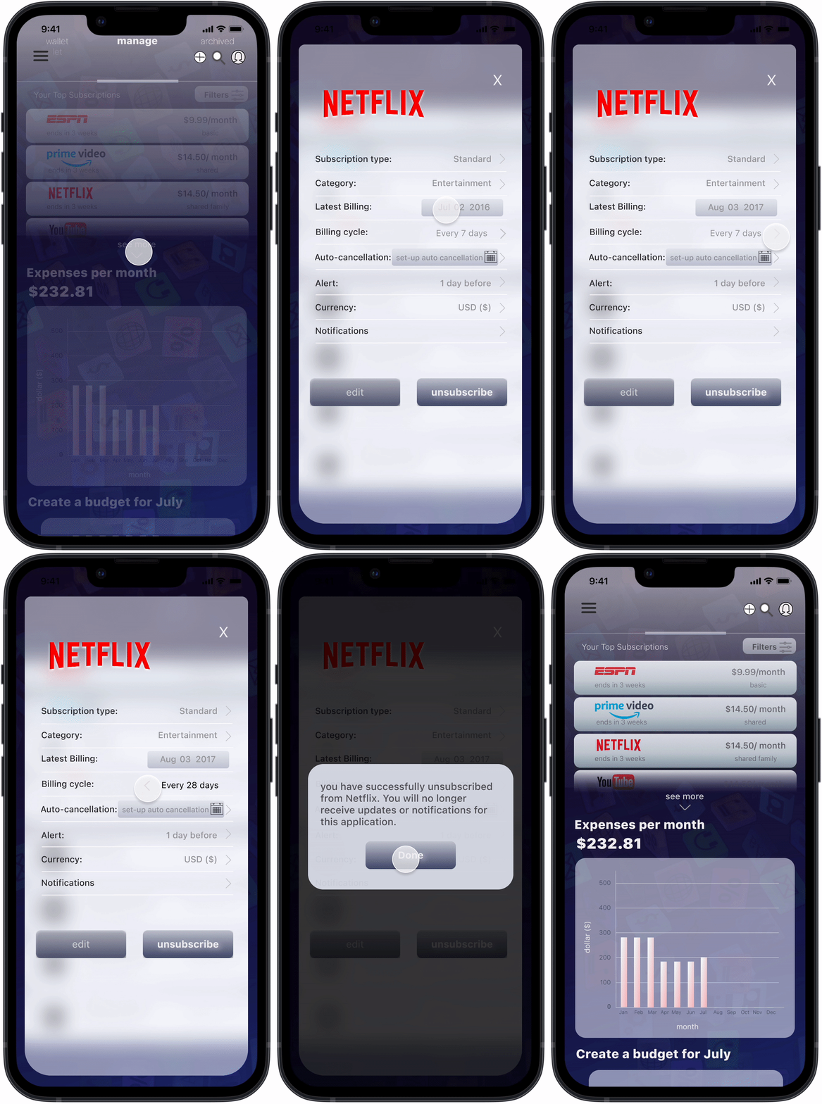
User Flow 1- As a current user, I want to organize all my subscriptions so I can get a comprehensive view of my spending
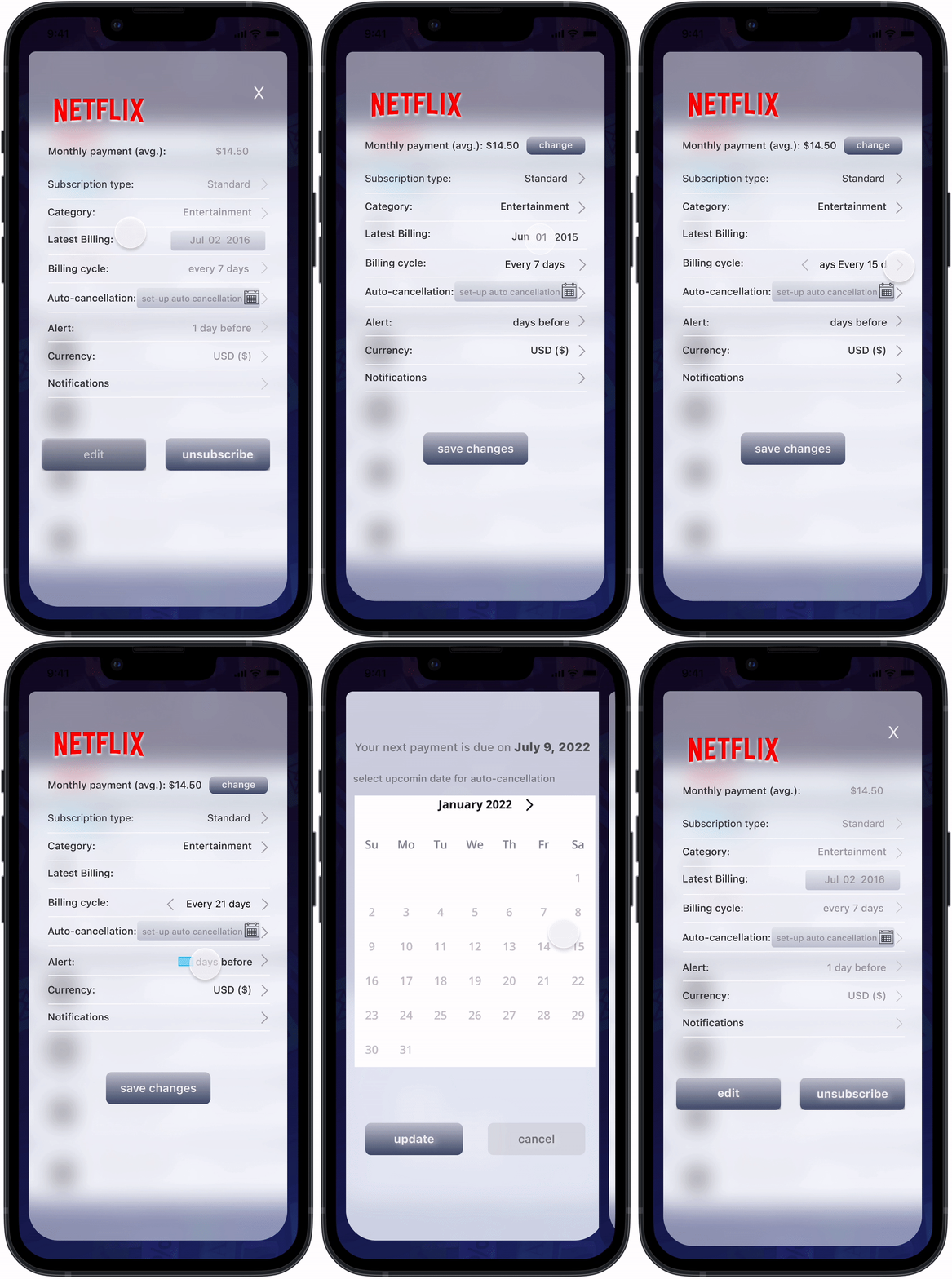
User Flow 2- As a returning user, I want to track my subscriptions so I can monitor my usage.
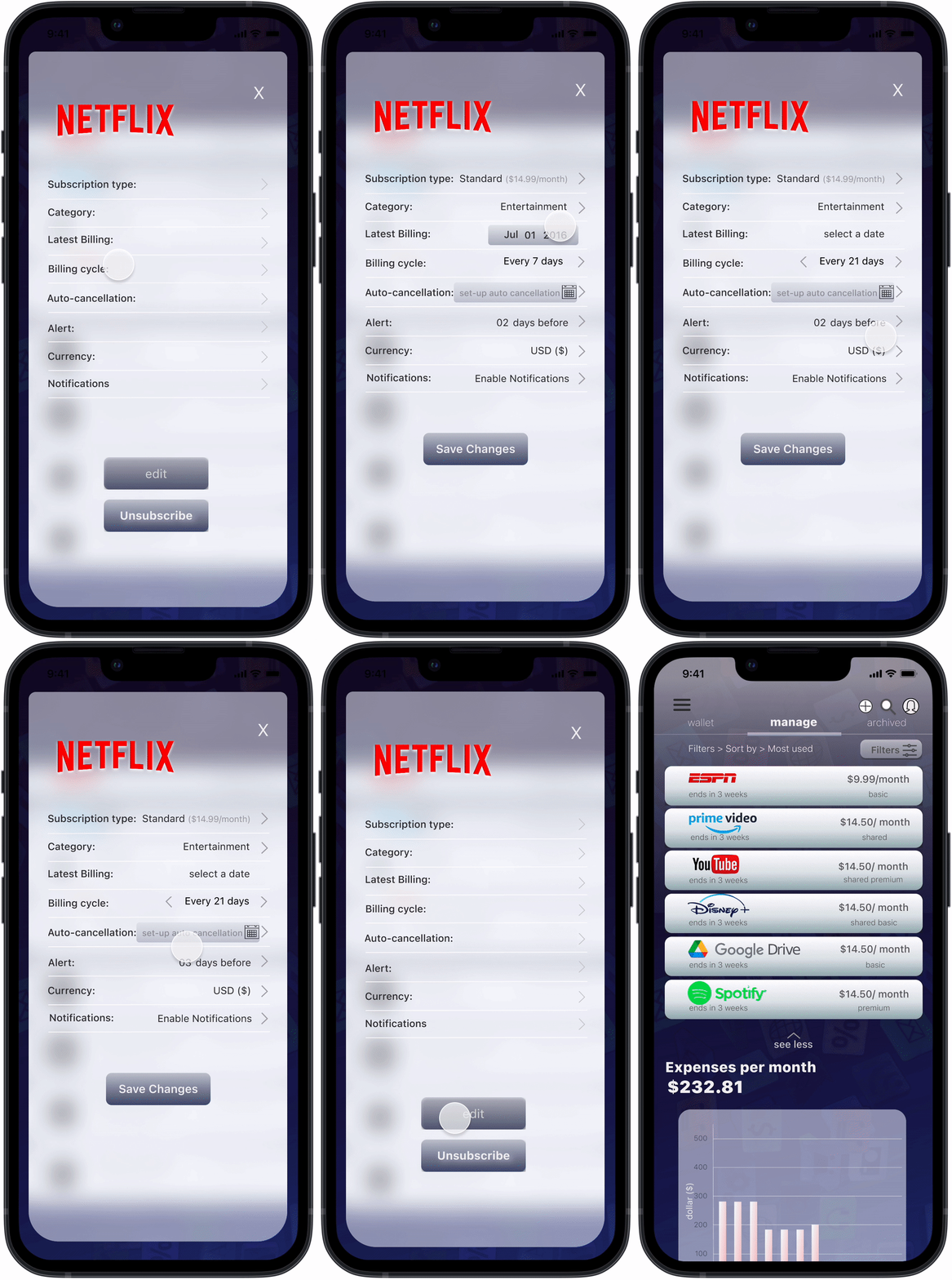
User Flow 3- As a returning user, I want to have auto-cancellation so I can eliminate idle/ unused apps.
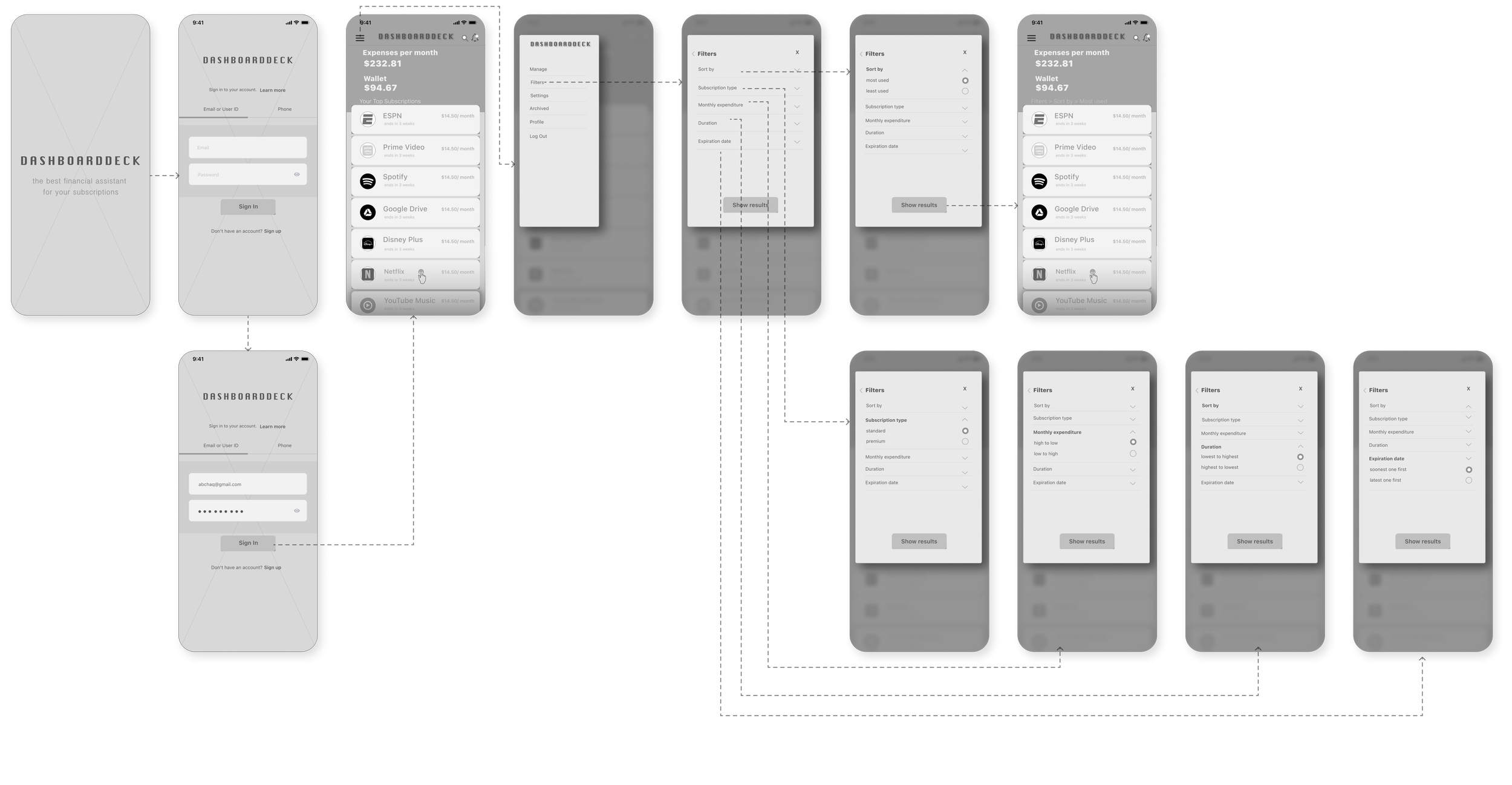
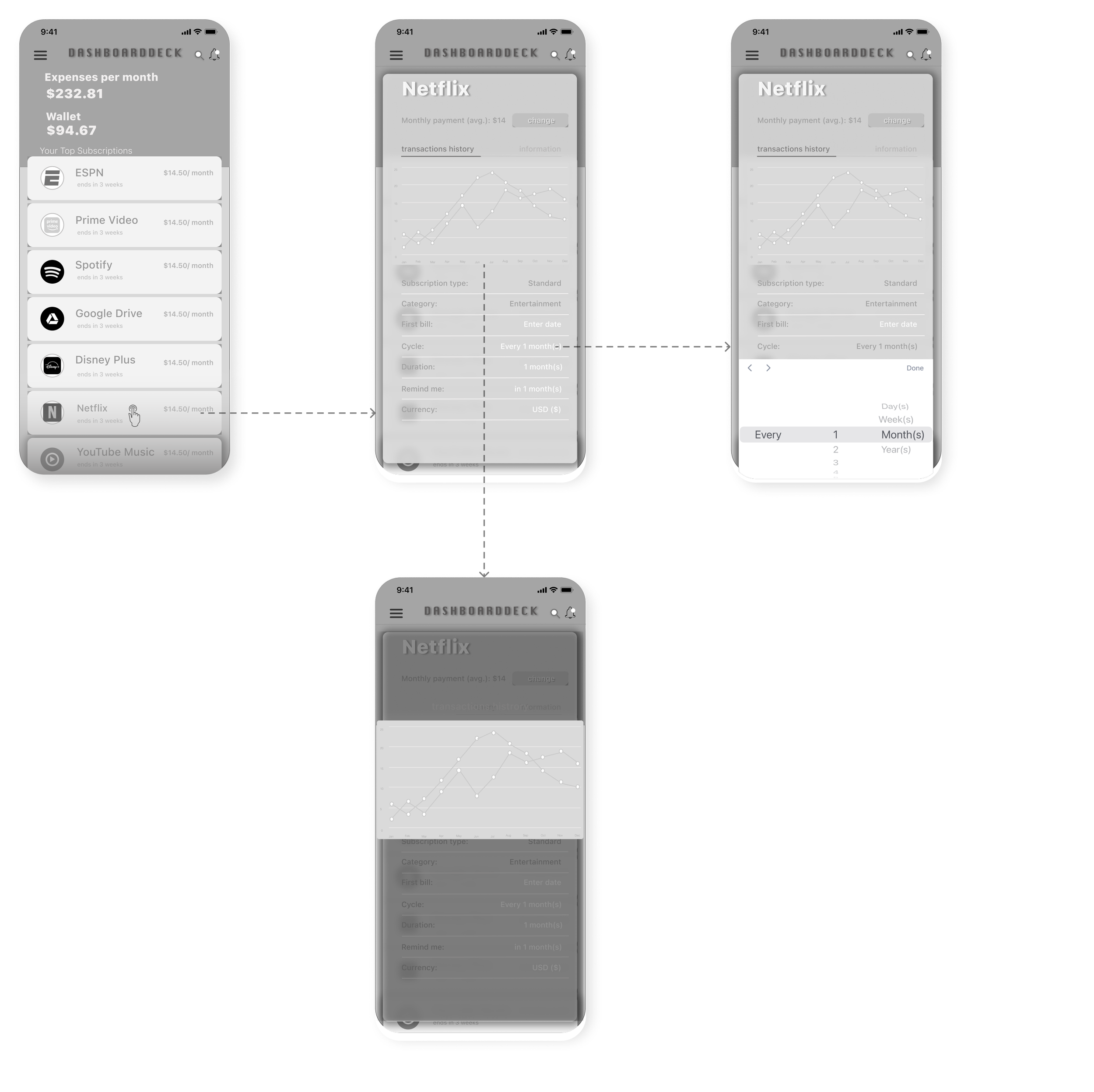
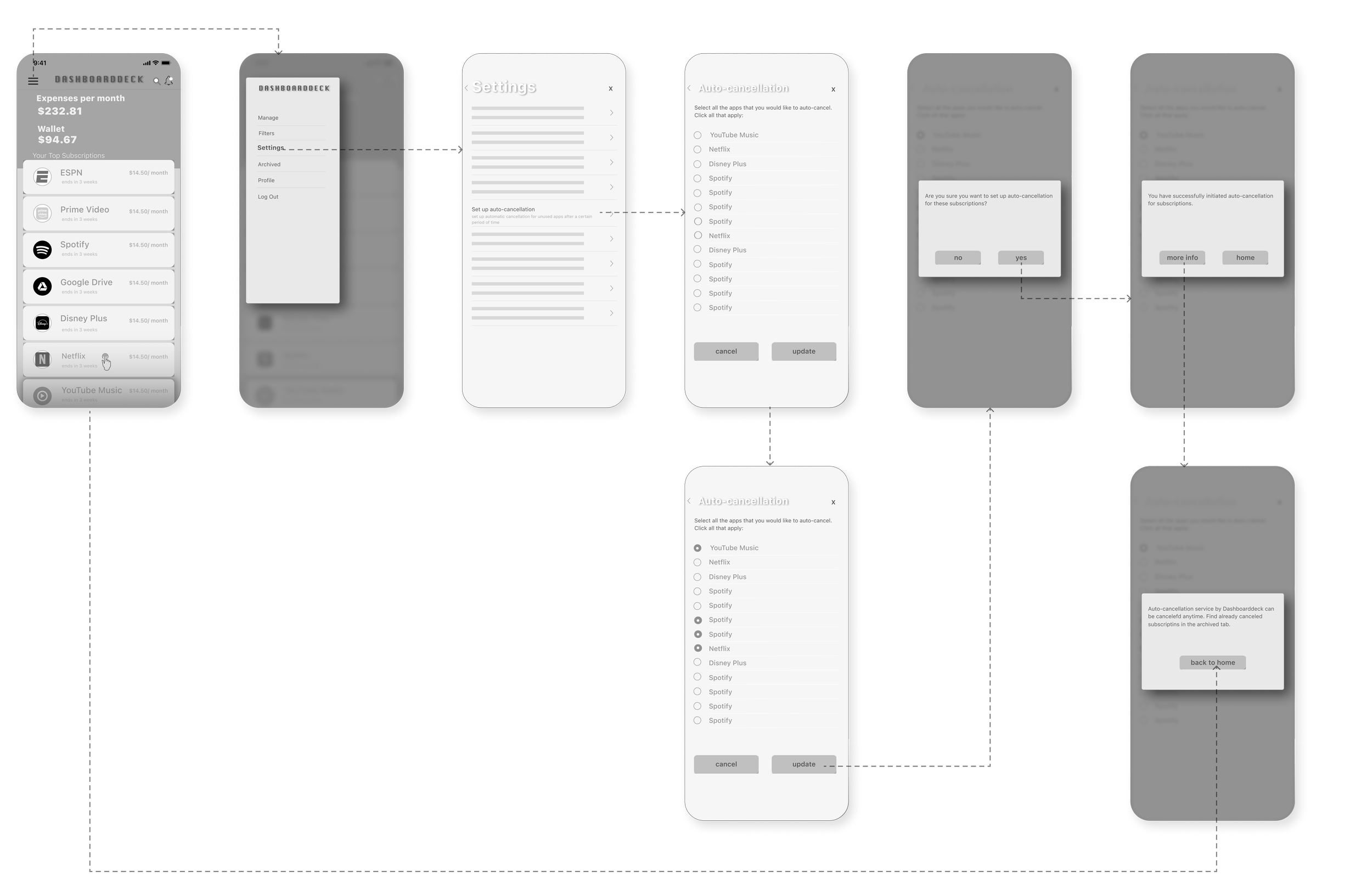
Low Fidelity Wireframes
Using the diagrams from the user flows, I made low-fidelity wireframes to visualize & understand how the users would navigate through different pages of the app. I made simple and monochromatic drawings of different pages for each user flow. This was a good starting off point for hi-fidelity prototypes with more detailed & fleshed-off pages.
user flow 1- As a current user, I want to organize all my subscriptions
user flow 2- As a returning user, I want to track my subscriptions to monitor my usage.
user flow 3- As a returning user, I want to have auto-cancellation to eliminate idle/ unused apps.
Guerilla Usability testing
Guerilla usability testing was done remotely, on four participants. In the tests, participants were asked to complete each flow from start to finish & let the tester know about the simplicity of the process. Testing revealed some valuable information about the user flows for these critical tasks-
3/4 participants were able to find their way to certain functions like using the hamburger button to locate filters & settings.
1/4 participant asked to bring the filter button on the homepage so it’s clearly visible.
1/4 user talked about making the home page more curated so it feels deliberate.
2/4 user mentioned that there needs to be a graph for net expenditure for all the apps combined on the home page rather than individual ones inside the app overview pages.
Style Guide
I made the style guide for color palette, fonts & other UI elements to get a better idea about the product’s brand & appearance. The selected colors are slightly gray & muted so they don’t appear too loud or noisy
Prototype
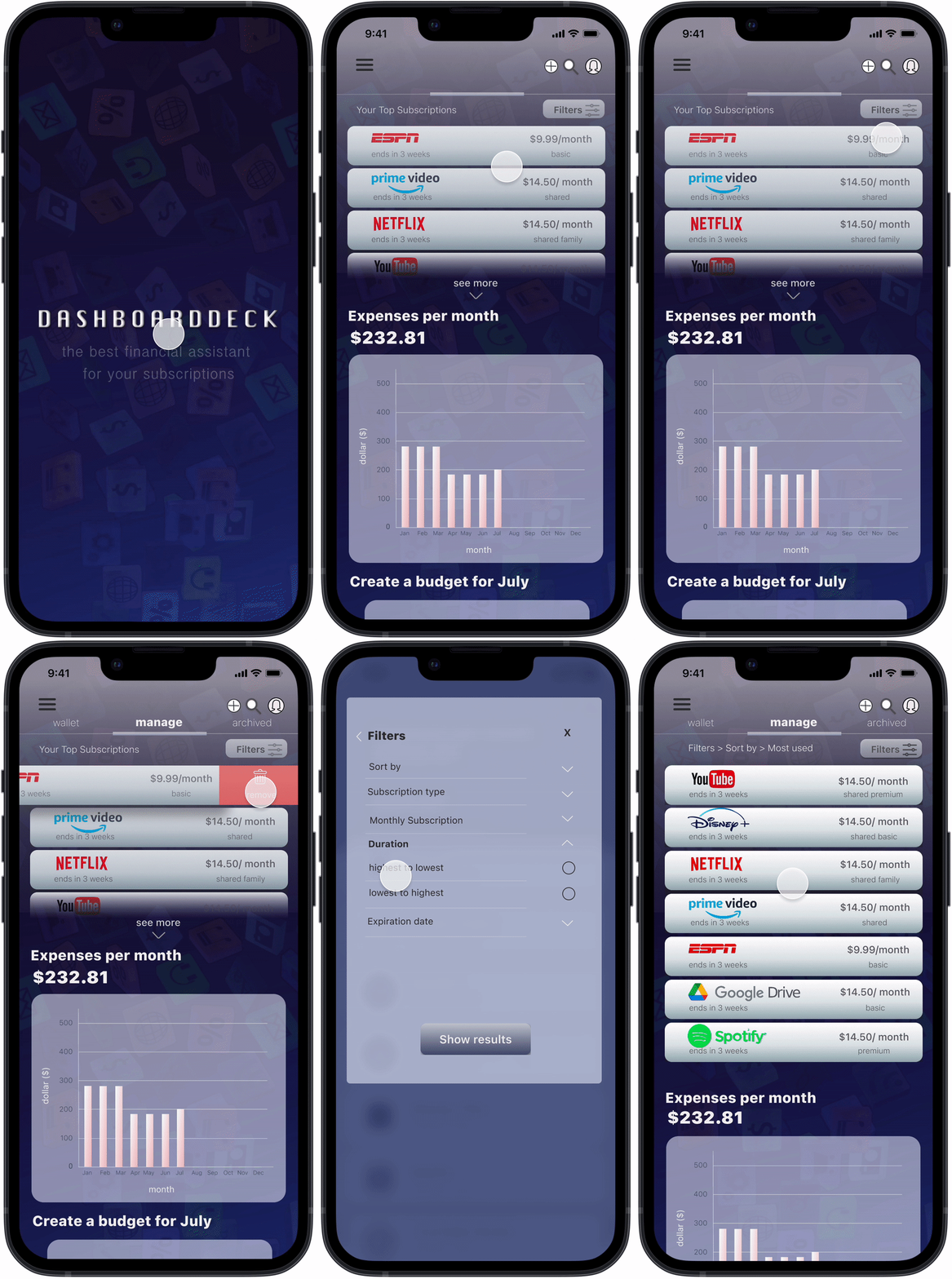
With the comments & feedback received from the Guerilla testing, I moved on creating hi-fidelity wireframes & their prototypes.. The goal of this step was to get a more solid understanding of the app’s structure. I used the style guide that’s previously shown to draw inspiration for my color palette & overall UI design.
Hi-Fi Mockups- Iteration One
user flow 1- user wants to organize all their subscriptions
user flow 2- user wants to track subscriptions to monitor usage
user flow 3- user wants to have auto-cancellation to eliminate idle/ unused apps
Test
Usability Test Findings
The second round of usability tests were conducted on the hi-fidelity prototype’s first iteration. Feedback from last usability tests were taken into account to make updates. The purpose of the second usability tests was to get an idea of how the app is functioning with all the updates.
Feedback:
Monthly payment on the app overview should not be customizable on user flow-2.
Revision:
On user flow-2, on the app overview page, next to subscription type, the type of subscription along with the amount of money spent is mentioned to avoid confusion & user stress, that interaction has been removed.
Feedback:
Having an edit button on the app overview page is counter-intuitive.
Revision:
On the app overview page, the Edit button is placed on top of the unsubscribe button to make the interaction deliberate instead of being more casual.
See user flow -2 prototype’s second iteration here.
Ending Words
The newly iterated version of the hi-fidelity mockup is certainly not the end- there is definitely room for improvement. Given the time, I would really like to explore other user flows to gauge the actual workability of this application, and user tests are essential in achieving that goal.
This project was an interesting one to say the least- it broke the fixed mindset of designing an application using a set process. As the next steps of the project, I would really love to design more customizable control buttons like real time monitoring of app usage, easily switchable dates for subscribing & unsubscribing, & multi-language accessibility for attracting a larger, global audience to make the experience smoother.
You May Also Like
