A Platform for Selling, Buying and Trading Plants
UX/ UI Case Study- Student Project
Sep 2021- Nov 2021
My Role: Sole Product Designer responsible for end-to-end process
PlanetPlant was formed by asking a simple question- How might we reduce the stress of a plant enthusiast and establish trust among different plant people to swap/ trade plants who’ve never met each other.
Plant communities anywhere in the world are trusting and resilient. Even then, the question remains-
Overview
Background
Plants are great for the over-all mental well-being of people. Buying plants can be expensive; a great alternative is trading or swapping or buying cuttings from other plant owners. Only problem is that, plant swapping idea is still relatively new & plant swap and trades are limited to social media groups.
Solution
To lift the veil of confusion and restore faith in the whole process, the app PlanetPlant was conceptualized.
PlanetPlant’s Journey to App-Hood
Discovery
Competitive Analysis
I began my research by looking into industry leaders, like Mercari, facebook marketplace, plantswap.org, OfferUp, Etsy, & Blossm. I based my analysis on some of the principles of Nielsen Norman Usability Heuristics:
User control & Freedom
Flexibility & efficiency of use
Aesthetic & minimalist design
Based on the analysis, I gathered some helpful insights.
I sent out a survey request form on various social media platforms hoping to find plant enthusiasts in the process. After getting responses back from 26 plant lovers, I randomly selected 5 participants for conducting the user interview.
Some of the most important questions I was trying to get answers to were:
What drives people to trade/ swap plants rather than buying?
What are the risks/opportunities associated with plant trading?
What types of plants are most popular for trading?
Are people more interested in trading generic plants or rare plants?
What are the most important aspects of plant trading?
User Interviews
number of plants owned
3/5 owned more than 40 plants
thoughts on plant trading
2/5 people like plant trading
types of plants owned
3/5 people said they like niche plants
2/5 participants said that they go to the store once a week while other 2/5 said that they go to the plant store once every couple weeks
experience on plant trading
3/5 people said they didn’t like it
shopping habits
Throughout my interview, I tried understanding the participants’ attitude towards local plant shops, online purchase habits, emotional attachments with plant purchases, big box stores’ plants as well their overall thoughts on online trading outside of their localities. To visualize their responses clearly, I put them in charts.
number of years collecting plants
3/5 people said they had 0-1 yrs experience
shopping locations
3/5 participants said they go to local nurseries for sourcing plants
Using the important information from each interview, I created an Affinity Map. I looked for common themes, patterns, motivators and desired feature that would give me insights into what my strategy would look like moving forward.
Affinity Map
beginning
progress
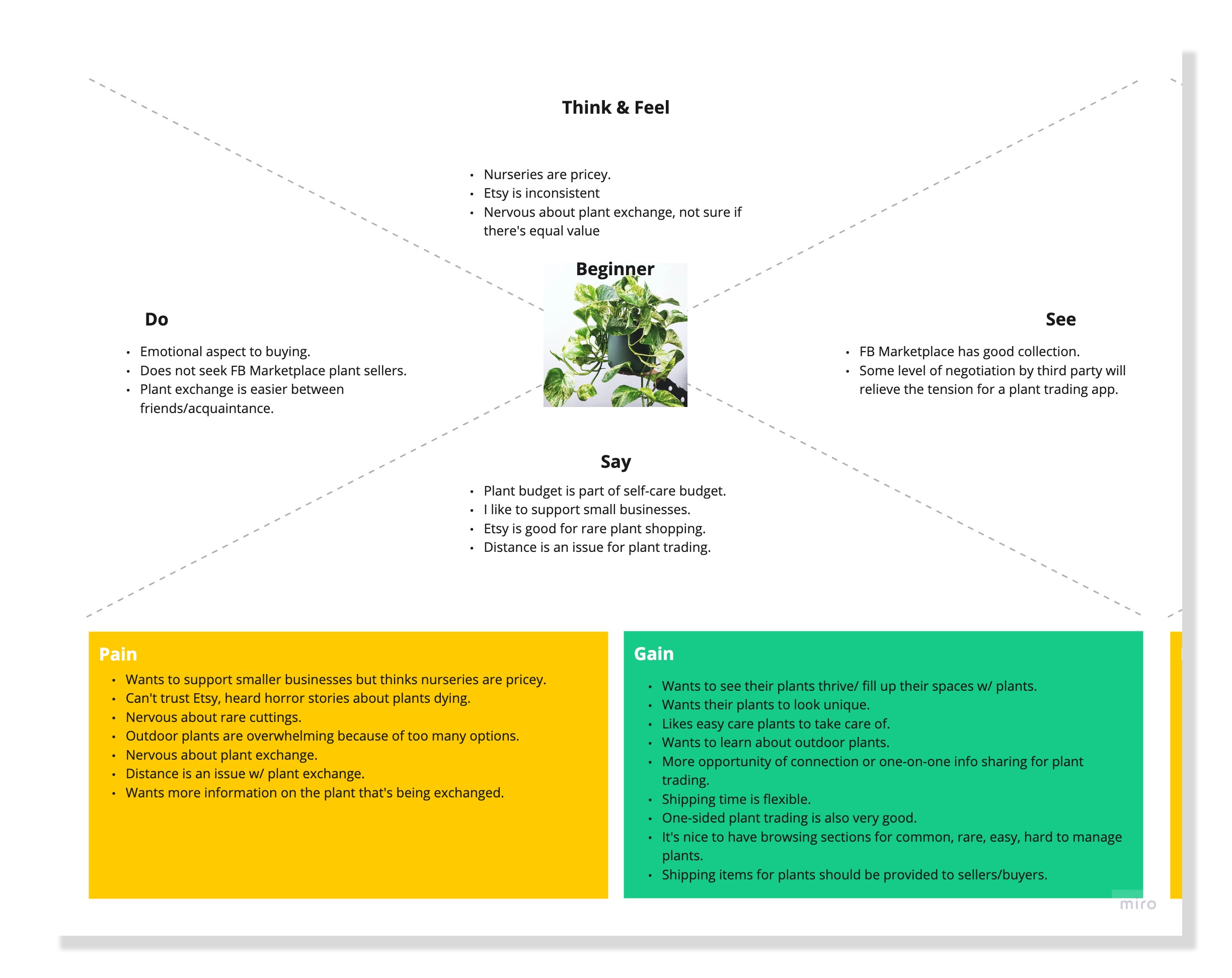
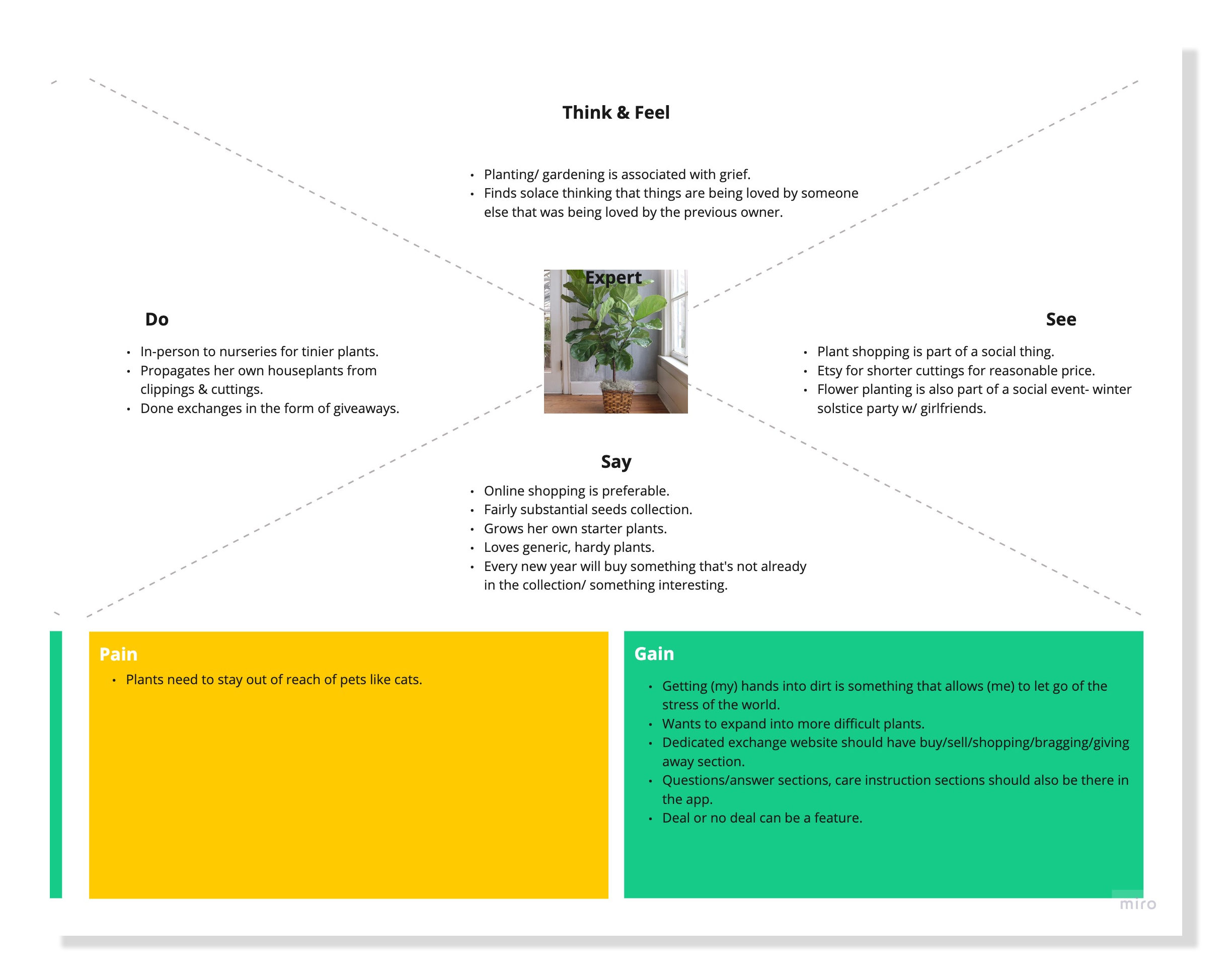
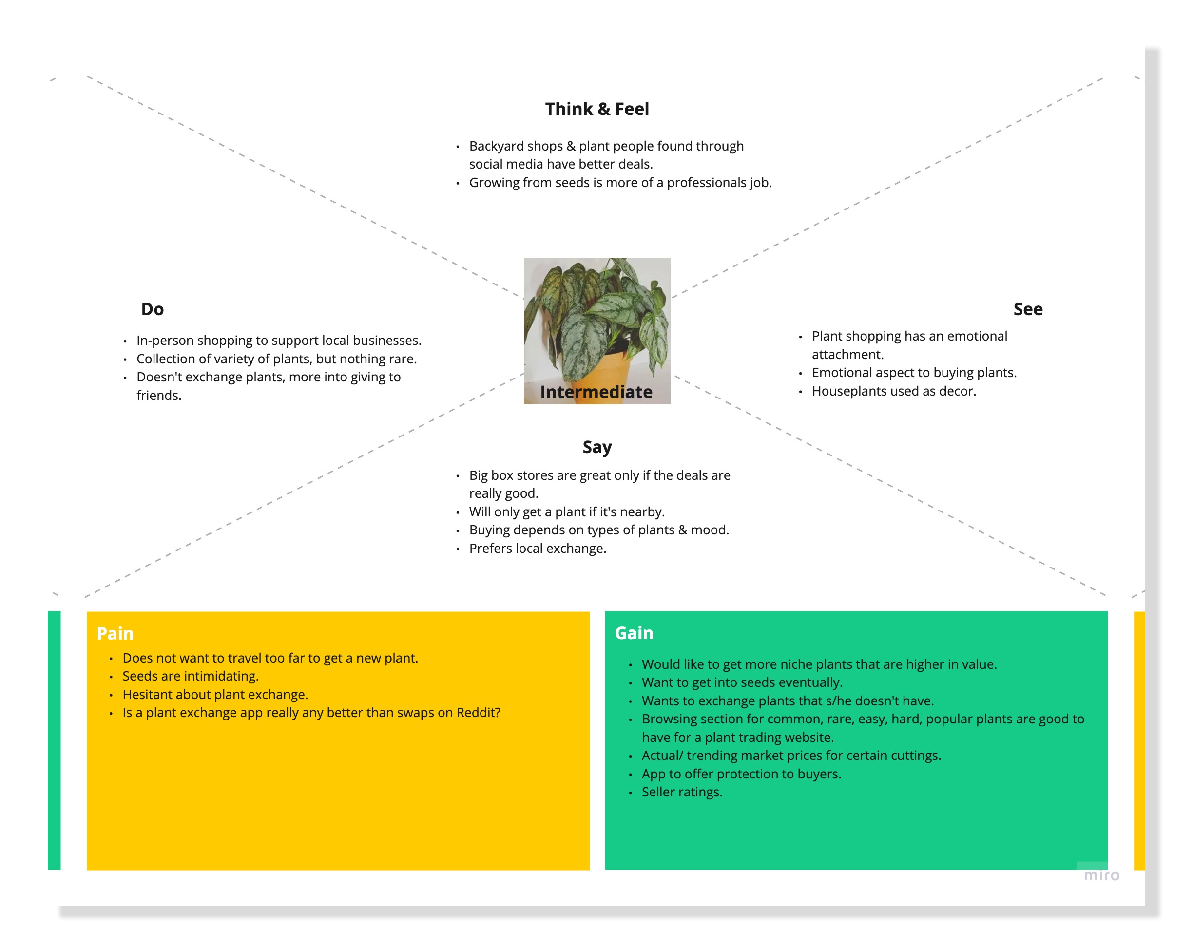
To better understand the potential users, I made empathy maps that broke down what they say, do, think and feel and see. This helped me define three user types:
The beginners were people only getting started in their plant journey.
The intermediates were people who had some knowledge of plants but had reservations about certain types of transactions.
The experts were people who had been taking care of plants for years and were very interested in all aspects of plant exchanges.
Empathy Mapping
Persona Development
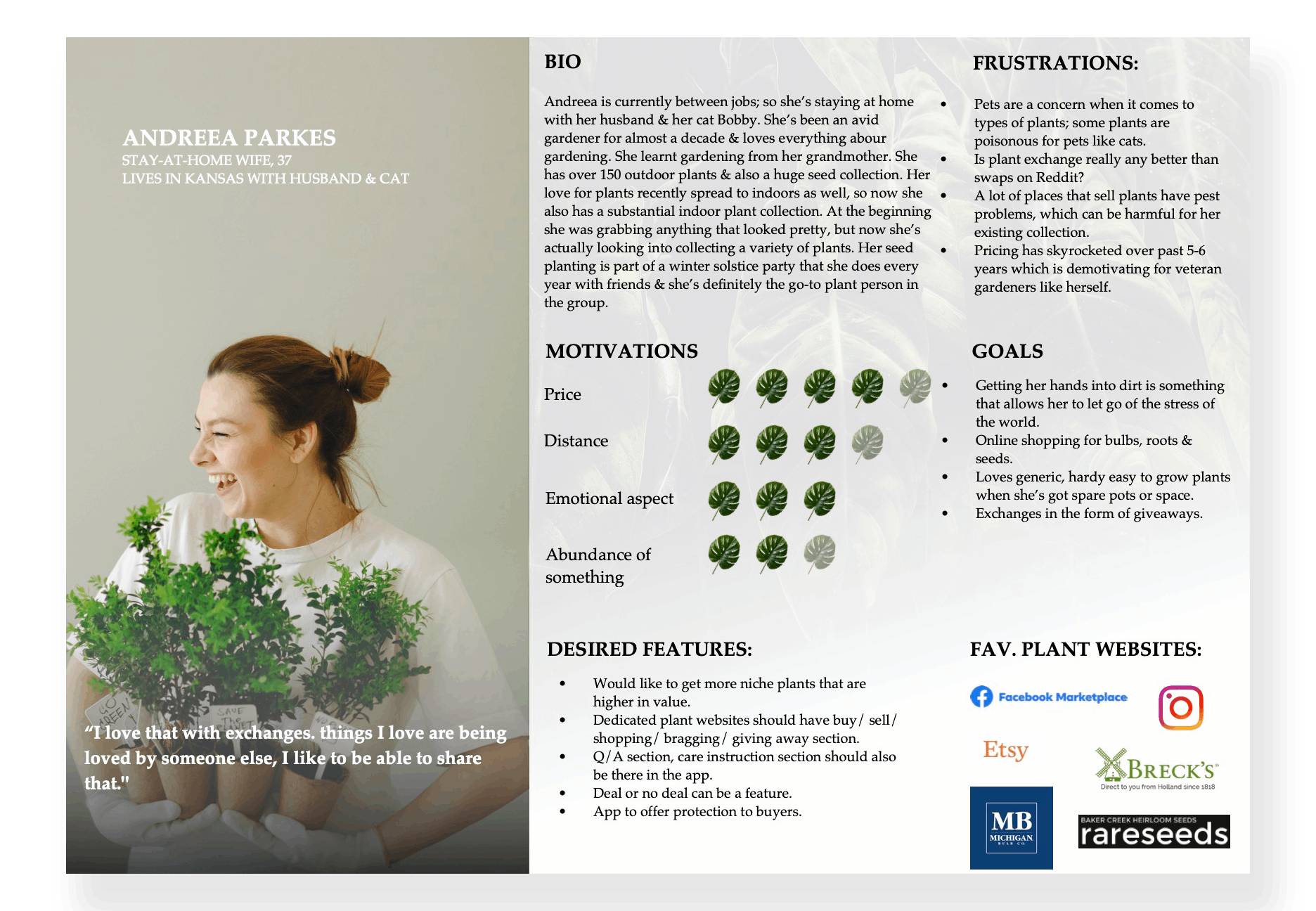
Based on the information and insights gathered up to this point, I constructed two main user personas that represented the primary user base of my product.
Ideation
I used several brainstorming strategies to start on the path towards solutions. I used the “How Might We” questions to start brainstorming. These exercises were quick and were done with instant ideas rather than long thought-out ones, so many interesting and critical problems.
Brainstorming
Designing
Following the creation of the user flow diagrams, I jot down some quick, low fidelity sketches for both mobile and desktop versions for the three scenarios- registering and exploring the plant site, buying a plant & checking out and trading a plant.
see the PDF file for all the sketches here
User Flow Sketches
Usability Testing- Round 1
Feedback from the participants for the first round of the usability test was very useful. They were mostly satisfied with the screens- the only comment that I received was for the user flow where the user wants to trade a plant . In that scenario, most participants agreed that the trade button needs to be down at the navigation panel so it’s easily discoverable by everyone.
Based on the feedback from my initial interviews and guerilla usability testings, I began wireframing low-fidelity screens for all the tasks that the user would be completing: registration & onboarding, buying a plant & checking out and then trading a plant. Here is one instance:
Sketching Low Fidelity Wireframes
For a more detailed view, please click here.
Before moving on to the hi-fi mockups, I made a list of items in my style guide to give myself a solid idea about the look & feel of the application. My mission was to build a tool that would be used as a one stop solution for all plant enthusiast’s needs. With that in mind, I tried to design my brand as a fresh, new, and trendy platform that can attract plant enthusiasts.
Style Guide
Prototyping
Iterations of various screens led me to my first Hi-Fidelity designs. The color palette represents the tones of the earth and the designs are built with a familiar pattern for ease of use for the user.
Hi-Fidelity Mockups
User Flow-3: Trading a Plant
Have a look at the prototypes here
Test
First round of usability tests were conducted on 5 participants, who ranged from people who bought plants once every couple months to people who bought plants a couple of times a week . Testing uncovered 3-4 critical usability issues and opportunities for improvement. Based on those comments, changes were made in the updated prototype.
Usability Test Findings
Feedback:
The bottom navigation bar might be too bold in color, size and contrast, buttons could be smaller and contrast could be lowered.
Background UI of the home screen is getting in the way of everything- from overall navigation to finding the listings.
Revision:
Bottom nav bar has a softer hue, the buttons are also smaller. Also, the homepage background is more simplified and has only one tone.
Feedback:
User flow for trading is a bit confusing. Although designed to avoid ambiguity during the process of trading, in usability testing it was counterintuitive to some users as they wanted the experience of trading to be different from the experience of buying. Some users also wanted to add the option of having “add an existing item from your listings” to the trade so it’s faster and not redundant.
Revision:
Trading process is distinguished from the buying process and traders can now add their existing listings to the trade instead of typing the same information twice for faster user experience.
See prototype version 2 here
new iteration
Thoughts & Revision Ideas
Further exploration into the process of buying where I get to explore the edge cases i.e. how to navigate a purchase if the person on either end decide to not proceed with the transaction.
Have failsafes like purchase protection to make sure that traders on both end follow through with trade to avoid monetary penalty.
Add plant care tutorials in the mix for the new plant owners to increase versatility of app use.
Update & change the overall UI to better adhere to the WCAG & ADA standards.
Integrate the web format so the app can be accessed through multiple modals.
You May Also Like


